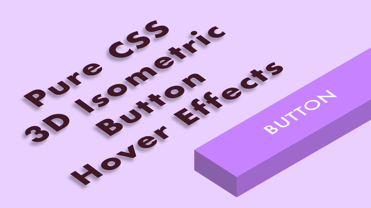
Pure CSS 3D Isometric Button Hover Effects
01/22/2021
Demo
Code
HTML
<!DOCTYPE html>
<html lang="en">
  <head>
    <meta charset="UTF-8">
    <meta name="viewport" content="width=device-width,initial-scale=1">
    <title>Pure CSS 3D Isometric Button Hover Effects</title>
    <link rel="stylesheet" type="text/css" href="https://demo.plantpot.works/assets/css/normalize.css">
    <link rel="stylesheet" href="https://use.typekit.net/opg3wle.css">
    <link rel="stylesheet" type="text/css" href="style.css">
  </head>
  <body>
    <div id="container">
      <div class="box">
        <button class="btn">BUTTON</button>
      </div>
    </div>
  </body>
</html>
CSS
@charset "utf-8";
* {
  box-sizing: border-box;
  margin: 0;
  padding: 0;
}
html {
  font-size: 16px;
}
body {
  background-color: #e9d0ff;
  font-family: futura-pt, sans-serif;
  -webkit-tap-highlight-color: rgba(0,0,0,0);
}
#container {
  display: flex;
  justify-content: center;
  align-items: center;
  position: relative;
  width: 100%;
  height: 100vh;
}
.box {
  display: flex;
  justify-content: center;
  align-items: center;
  position: relative;
  width: 100%;
  max-width: 300px;
  height: 100%;
  max-height: 300px;
  padding: 10px;
}
.btn {
  position: relative;
  transform: rotate(-30deg) skew(25deg);
  width: 200px;
  height: 50px;
  border: none;
  background-color: #c783ff;
  color: #fff;
  font-size: 1.25rem;
  letter-spacing: 2px;
  outline: none;
  cursor: pointer;
}
.btn::before {
  position: absolute;
  top: 10px;
  left: -20px;
  z-index: 10;
  transform: rotate(0) skewY(-45deg);
  width: 20px;
  height: 100%;
  background-color: #8860aa;
  content: '';
}
.btn::after {
  position: absolute;
  top: 50px;
  left: -10px;
  transform: rotate(0) skewX(-45deg);
  width: 100%;
  height: 20px;
  background-color: #9f69cc;
  content: '';
}
.btn:hover {
  transform: translateY(20px) rotate(-30deg) skew(25deg);
}
.btn:hover::before {
  width: 0;
}
.btn:hover::after {
  height: 0;
}