Wave Animation Effects with HTML & CSS
06/19/2020
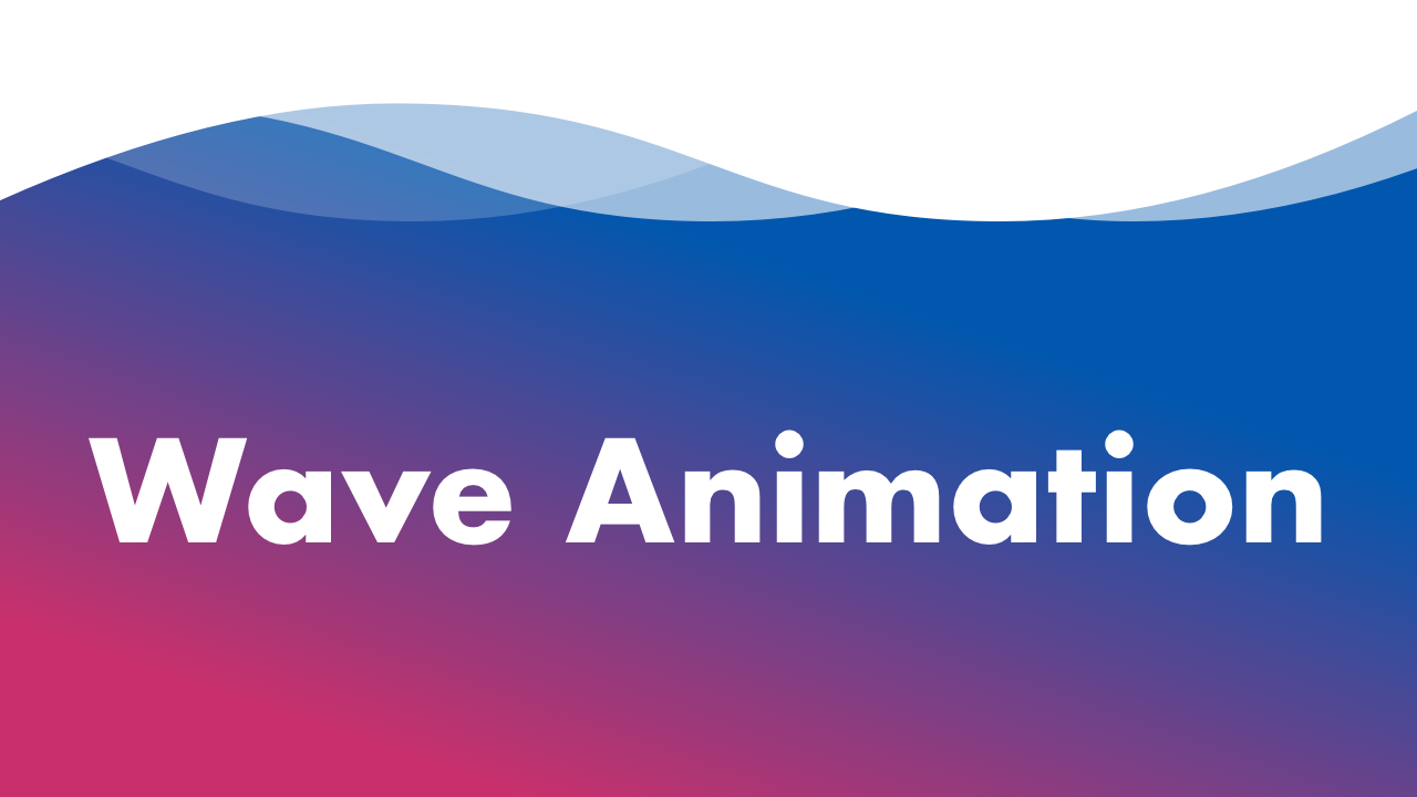
Demo
Video Tutorial
Code
HTML
<!DOCTYPE html>
<html>
  <head>
    <title>Wave Animation</title>
    <link rel="stylesheet" type="text/css" href="style.css">
  </head>
  <body>
    <div id="container">
      <h1>Wave Animation</h1>
      <div class="wave"></div>
    </div>
  </body>
</html>
CSS
@import url('https://fonts.googleapis.com/css2?family=Roboto:wght@400&display=swap');
body {
  margin: 0;
  padding: 0;
  font-family: 'Roboto', sans-serif;
}
h1 {
  font-size: 12vw;
  color: #fff;
}
#container {
  position: relative;
  width: 100%;
  height: 100vh;
  display: flex;
  justify-content: center;
  align-items: center;
  background: url(bg.png);
  background-size: cover;
}
.wave {
  position: absolute;
  width: 100%;
  padding-top: 12%;
  top: -5px;
  left: 0;
  background-image: url(wave.png);
  background-repeat: repeat-x;
  background-size: 100%;
  animation: wave 8s linear infinite;
}
.wave::before {
  content: '';
  position: absolute;
  width: 100%;
  padding-top: 12%;
  top: -5px;
  left: 0;
  background-image: url(wave.png);
  background-repeat: repeat-x;
  background-size: 100%;
  opacity: .2;
  animation: wave-reverse 8s linear infinite;
}
.wave::after {
  content: '';
  position: absolute;
  width: 100%;
  padding-top: 12%;
  top: -5px;
  left: 0;
  background-image: url(wave.png);
  background-repeat: repeat-x;
  background-size: 100%;
  opacity: .8;
  animation-delay: -4s;
  animation: wave 16s linear infinite;
}
@keyframes wave {
  0% {
    background-position: 0;
  }
  100% {
    background-position: 100vw;
  }
}
@keyframes wave-reverse {
  0% {
    background-position: 100vw;
  }
  100% {
    background-position: 0;
  }
}