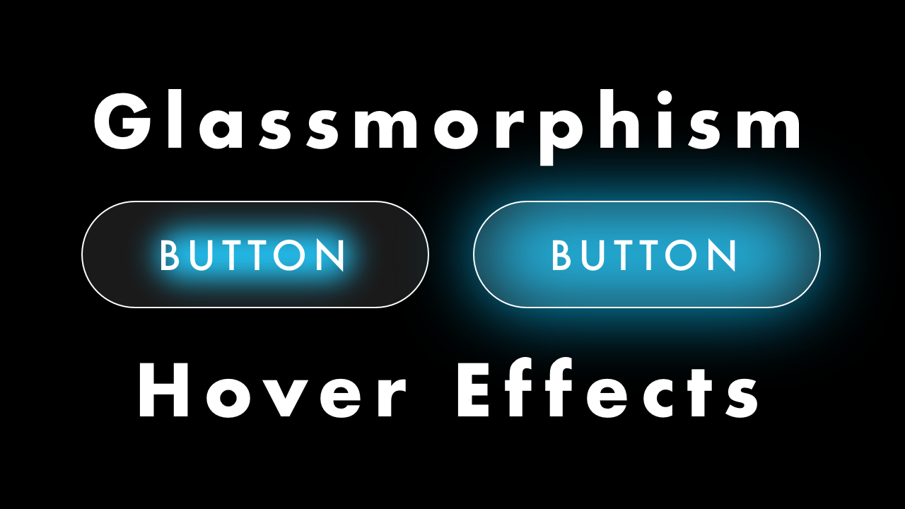
Glassmorphism Button Hover Effects with HTML & CSS
02/25/2022
Demo
Code
HTML
<!DOCTYPE html>
<html lang="en">
  <head>
    <meta charset="UTF-8">
    <meta name="viewport" content="width=device-width,initial-scale=1">
    <title>Glassmorphism Button Hover Effects</title>
    <link rel="stylesheet" type="text/css" href="https://demo.plantpot.works/assets/css/normalize.css">
    <link rel="stylesheet" href="https://use.typekit.net/opg3wle.css">
    <link rel="stylesheet" type="text/css" href="style.css">
  </head>
  <body>
    <div id="container">
      <button class="btn">BUTTON</button>
    </div>
  </body>
</html>
CSS
@charset "utf-8";
* {
  box-sizing: border-box;
  margin: 0;
  padding: 0;
}
html {
  font-size: 16px;
}
body {
  background-color: #000;
  font-family: futura-pt, sans-serif;
  -webkit-tap-highlight-color: rgba(0,0,0,0);
}
#container {
  display: flex;
  justify-content: center;
  align-items: center;
  position: relative;
  width: 100%;
  height: 100vh;
}
.btn {
  position: relative;
  z-index: 10;
  width: 200px;
  height: 60px;
  border: 1px solid rgba(255, 255, 255, .5);
  border-radius: 30px;
  background-color: rgba(255, 255, 255, .1);
  color: #fff;
  font-size: 1.25rem;
  letter-spacing: 1px;
  -webkit-backdrop-filter: blur(10px);
  backdrop-filter: blur(10px);
  outline: none;
  cursor: pointer;
}
.btn::before {
  position: absolute;
  top: 15px;
  left: 50px;
  z-index: -1;
  width: 100px;
  height: 30px;
  border-radius: 50px;
  background-color: #0cbcf2;
  filter: blur(10px);
  content: "";
  transition: .5s;
}
.btn:hover::before {
  transform: scale(2);
}