Neumorphism Button Animation Effects on Hover with HTML & CSS
07/01/2020
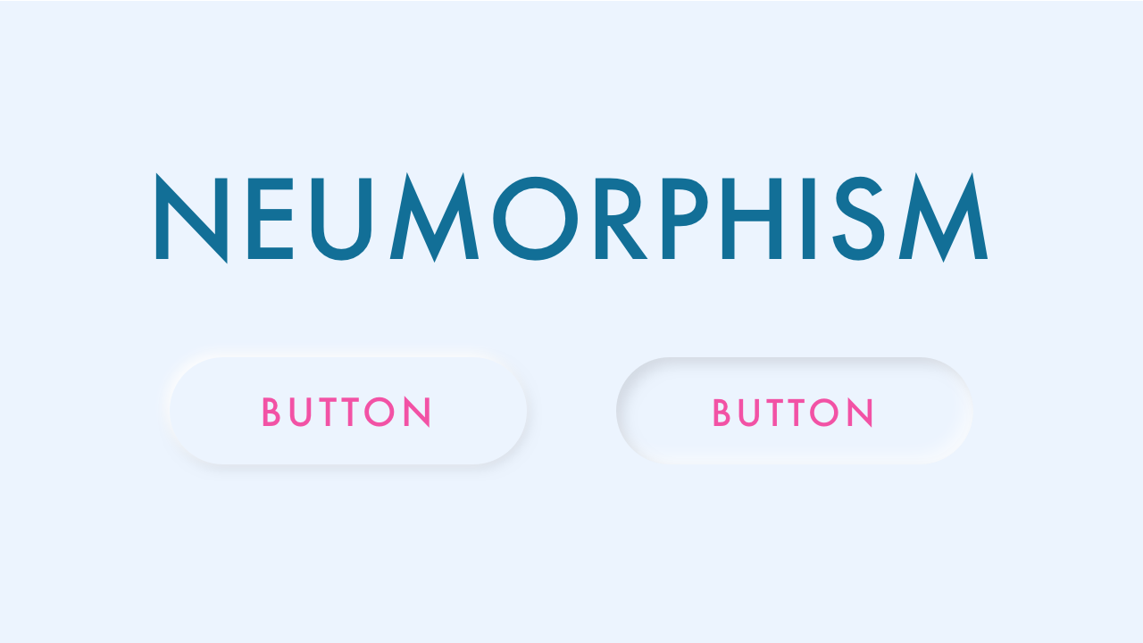
Demo
Video Tutorial
Code
HTML
<!DOCTYPE html>
<html>
  <head>
    <title>Neumorphism Button</title>
    <link rel="stylesheet" type="text/css" href="style.css">
  </head>
  <body>
    <div id="container">
      <button><span>Subscribe</span></button>
    </div>
  </body>
</html>
CSS
@import url('https://fonts.googleapis.com/css2?family=Roboto:wght@400&display=swap');
body {
  margin: 0;
  padding: 0;
  font-family: 'Roboto', sans-serif;
}
#container {
  width: 100%;
  height: 100vh;
  background: #ecf4fe;
  display: flex;
  align-items: center;
  justify-content: center;
}
button {
  position: relative;
  cursor: pointer;
  border: none;
  background: none;
  border-radius: 40px;
  box-shadow: -2px -2px 8px rgba(255, 255, 255, 1),
              -2px -2px 12px rgba(255, 255, 255, 0.5),
              inset 2px 2px 4px rgba(255, 255, 255, 0.1),
              2px 2px 8px rgba(0, 0, 0, 0.15);
  color: #f252a5;
  font-size: 24px;
  letter-spacing: 4px;
  padding: 25px 40px;
}
button:hover {
  box-shadow: inset -2px -2px 8px rgba(255, 255, 255, 1),
              inset -2px -2px 12px rgba(255, 255, 255, 0.5),
              inset 2px 2px 4px rgba(255, 255, 255, 0.1),
              inset 2px 2px 8px rgba(0, 0, 0, 0.15);
}
button:hover span {
  display: inline-block;
  transform: scale(0.98);
}