Neumorphism Toggle Switch with HTML & CSS
02/24/2022
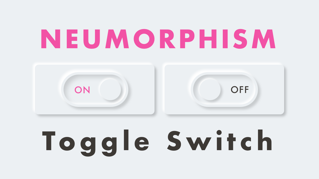
Demo
Video Tutorial
Code
HTML
<!DOCTYPE html>
<html lang="en">
  <head>
    <meta charset="UTF-8">
    <meta name="viewport" content="width=device-width,initial-scale=1">
    <title>Neumorphism Toggle Switch</title>
    <link rel="stylesheet" type="text/css" href="https://demo.plantpot.works/assets/css/normalize.css">
    <link rel="stylesheet" href="https://use.typekit.net/opg3wle.css">
    <link rel="stylesheet" type="text/css" href="style.css">
  </head>
  <body>
    <div id="container">
      <div class="box">
        <label class="switch">
          <input type="checkbox">
          <span class="slider"></span>
          <span class="on">ON</span>
          <span class="off">OFF</span>
        </label>
      </div>
    </div>
  </body>
</html>
CSS
@charset "utf-8";
* {
  box-sizing: border-box;
  margin: 0;
  padding: 0;
}
html {
  font-size: 16px;
}
body {
  background-color: #ecf0f3;
  font-family: futura-pt, sans-serif;
  -webkit-tap-highlight-color: rgba(0,0,0,0);
}
#container {
  display: flex;
  align-items: center;
  justify-content: center;
  position: relative;
  width: 100%;
  height: 100vh;
}
.box {
  display: flex;
  align-items: center;
  justify-content: center;
  position: relative;
  width: 200px;
  padding: 20px;
  border-radius: 5px;
  box-shadow: -2px -2px 8px rgba(255, 255, 255, 1),
              -2px -2px 12px rgba(255, 255, 255, 0.5),
              inset 2px 2px 4px rgba(255, 255, 255, 0.1),
              2px 2px 8px rgba(0, 0, 0, .3);
}
.switch {
  position: relative;
  display: inline-block;
  width: 80px;
  height: 40px;
  cursor: pointer;
}
.switch input {
  display: none;
}
.slider {
  position: absolute;
  top: 0;
  left: 0;
  right: 0;
  bottom: 0;
  border: 2px solid #ecf0f3;
  border-radius: 20px;
  box-shadow: -2px -2px 8px rgba(255, 255, 255, 1),
              -2px -2px 12px rgba(255, 255, 255, 0.5),
              inset -2px -2px 8px rgba(255, 255, 255, 1),
              inset -2px -2px 12px rgba(255, 255, 255, 0.5),
              inset 2px 2px 4px rgba(255, 255, 255, 0.1),
              inset 2px 2px 8px rgba(0, 0, 0, .3),
              2px 2px 8px rgba(0, 0, 0, .3);
  background-color: #ecf0f3;
}
.slider:before {
  position: absolute;
  bottom: 5px;
  left: 10px;
  z-index: 999;
  width: 24px;
  height: 24px;
  border-radius: 50%;
  box-shadow: -2px -2px 8px rgba(255, 255, 255, 1),
              -2px -2px 12px rgba(255, 255, 255, 0.5),
              inset 2px 2px 4px rgba(255, 255, 255, 0.1),
              2px 2px 8px rgba(0, 0, 0, .3);
  background-color: #ecf0f3;
  content: "";
  transition: .5s;
}
.off {
  position: absolute;
  top: 14px;
  right: 12px;
  color: #3d3935;
  font-size: .8125rem;
}
.on {
  position: absolute;
  top: 14px;
  left: 14px;
  color: #f252a5;
  font-size: .8125rem;
}
input:checked + .slider:before {
  transform: translateX(33px);
}