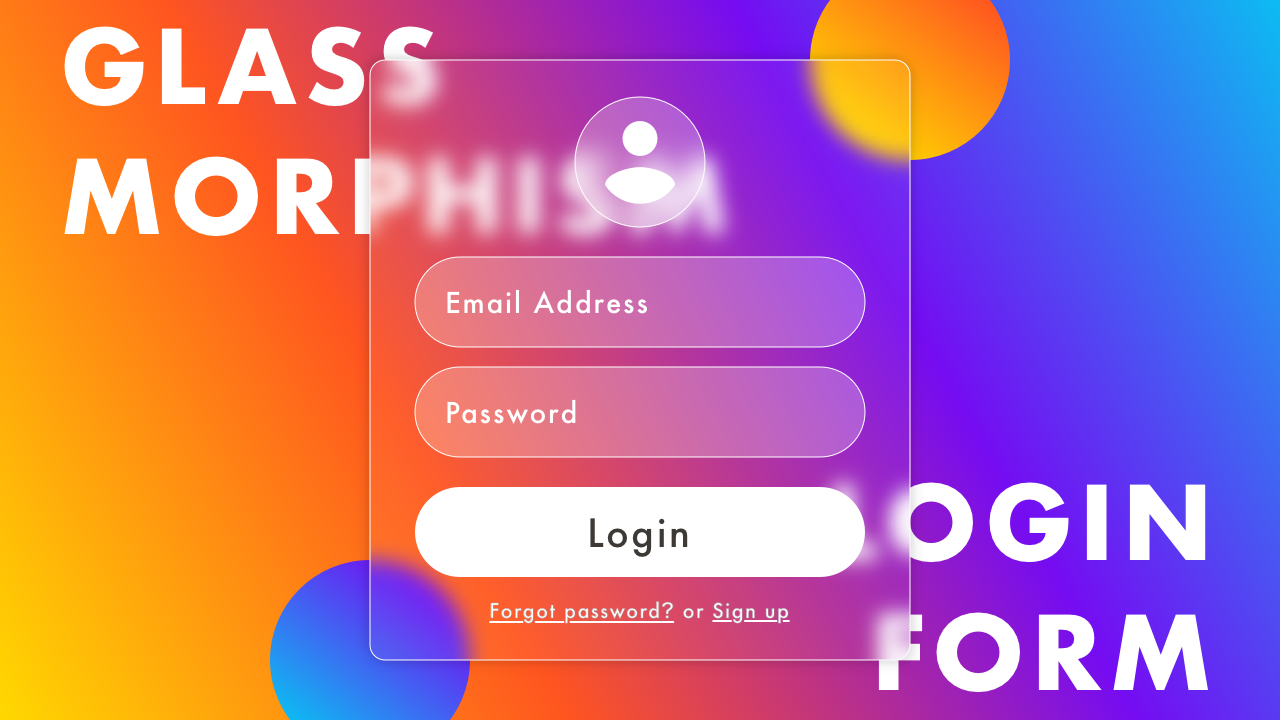
Glassmorphism Login Form with HTML & CSS
02/01/2021
Demo
Video
Code
HTML
<!DOCTYPE html>
<html lang="en">
  <head>
    <meta charset="UTF-8">
    <meta name="viewport" content="width=device-width,initial-scale=1">
    <title>Glassmorphism Login Form with HTML & CSS</title>
    <link rel="stylesheet" type="text/css" href="style.css">
  </head>
  <body>
    <div id="container">
      <div class="box">
        <div class="form-box">
          <div class="ic-account"></div>
          <form name="login-form" action="#" method="post">
            <input class="login-form-input" type="email" name="your-email" placeholder="Email Address" required>
            <input class="login-form-input" type="password" name="your-password" placeholder="Password" required>
            <button class="login-form-btn" type="submit">Login</button>
            <p class="text"><a href="#">Forgot password?</a> or <a href="#">Sign up</a></p>
          </form>
        </div>
        <div class="circle-01"></div>
        <div class="circle-02"></div>
      </div>
    </div>
  </body>
</html>
CSS
@charset "utf-8";
* {
  box-sizing: border-box;
  margin: 0;
  padding: 0;
}
html {
  font-size: 16px;
}
body {
  font-family: Arial, sans-serif;
}
#container {
  display: flex;
  justify-content: center;
  align-items: center;
  position: relative;
  width: 100%;
  height: 100vh;
  padding: 15px;
  background-image: linear-gradient(45deg, #ffd800, #ff5520, #750cf2, #0cbcf2);
  overflow: scroll;
}
.box {
  display: flex;
  justify-content: center;
  align-items: center;
  position: relative;
  width: 100%;
  max-width: 300px;
  height: auto;
  margin: auto;
}
.circle-01 {
  position: absolute;
  top: -45px;
  right: -45px;
  z-index: 1;
  width: 100px;
  height: 100px;
  border-radius: 50%;
  background-image: linear-gradient(45deg, #ffd800, #ff5520);
}
.circle-02 {
  position: absolute;
  bottom: -45px;
  left: -45px;
  z-index: 1;
  width: 100px;
  height: 100px;
  border-radius: 50%;
  background-image: linear-gradient(45deg, #0cbcf2, #750cf2);
}
.form-box {
  display: flex;
  flex-direction: column;
  justify-content: center;
  align-items: center;
  position: relative;
  z-index: 999;
  width: 100%;
  padding: 30px 20px;
  border: solid 1px rgba(255, 255, 255, .5);
  border-radius: 16px;
  box-shadow: 4px 4px 10px rgba(0, 0, 0, .1),
             -4px -4px 10px rgba(0, 0, 0, .1);
  background-color: rgba(255, 255, 255, .1);
  -webkit-backdrop-filter: blur(5px);
  backdrop-filter: blur(5px);
}
.ic-account {
  width: 60px;
  height: 60px;
  margin-bottom: 10px;
  border: solid 1px rgba(255, 255, 255, .5);
  border-radius: 50%;
  background-color: rgba(255, 255, 255, .2);
  background-image: url(ic_account.svg);
  background-position: center;
  background-size: 40px;
  background-repeat: no-repeat;
}
.login-form-input {
  width: 100%;
  height: 50px;
  margin: 10px auto;
  padding: 15px 20px;
  border: solid 1px rgba(255, 255, 255, .5);
  border-radius: 25px;
  background-color: rgba(255, 255, 255, .2);
  color: #fff;
  font-size: 1rem;
  outline: none;
}
.login-form-input::placeholder {
  color: rgba(255, 255, 255, .8);
}
.login-form-btn {
  width: 100%;
  height: 50px;
  margin: 20px auto 10px;
  border: none;
  border-radius: 25px;
  background-color: #fff;
  color: #3d3935;
  font-size: 1.25rem;
  outline: none;
  cursor: pointer;
}
.text {
  margin: 0;
  padding: 0;
  color: #fff;
  font-size: 0.875rem;
  text-align: center;
}
.text a {
  color: #fff;
}
.login-form-btn:hover,
.text a:hover {
  opacity: .8;
}