Gradient Button Animation Effects on Hover with HTML & CSS
07/03/2020
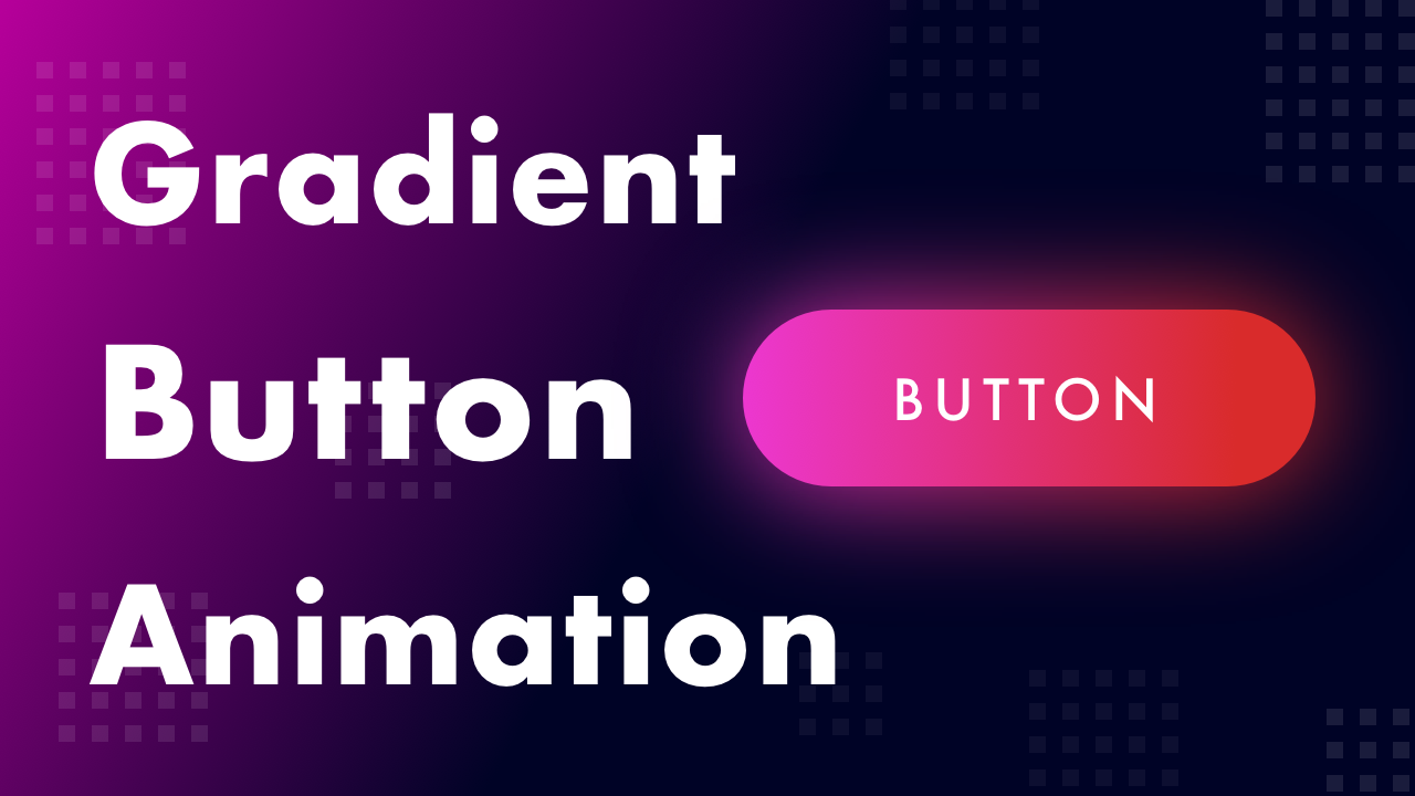
Demo
Video Tutorial
Code
HTML
<!DOCTYPE html>
<html>
  <head>
    <title>Gradient Button Animation Effects on Hover</title>
    <link rel="stylesheet" type="text/css" href="style.css">
  </head>
  <body>
    <div id="container">
      <button>SUBSCRIBE</button>
    </div>
  </body>
</html>
CSS
@import url('https://fonts.googleapis.com/css2?family=Roboto:wght@400&display=swap');
body {
  margin: 0;
  padding: 0;
  font-family: 'Roboto', sans-serif;
  background: #000326;
}
#container {
  width: 100%;
  height: 100vh;
  display: flex;
  align-items: center;
  justify-content: center;
}
button {
  position: relative;
  cursor: pointer;
  border: none;
  width: 300px;
  height: 80px;
  border-radius: 50px;
  outline: none;
  background: linear-gradient(90deg, #EC37D0, #D92B2B, #FFAA0D, #EC37D0);
  background-size: 400%;
  color: #fff;
  font-size: 24px;
  letter-spacing: 4px;
}
button::before {
  content: '';
  position: absolute;
  top: 0;
  left: 0;
  right: 0;
  bottom: 0;
  z-index: -1;
  background: linear-gradient(90deg, #EC37D0, #D92B2B, #FFAA0D, #EC37D0);
  background-size: 400%;
  border-radius: 50px;
  opacity: 0;
  transition: .5s;
}
button:hover {
  animation: animate 10s linear infinite;
}
button:hover::before {
  filter: blur(25px);
  opacity: .8;
  animation: animate 10s linear infinite;
}
@keyframes animate {
  0% {
    background-position: 0%;
  }
  100% {
    background-position: 400%;
  }
}