Glowing Gradient Border Effects with HTML & CSS
07/10/2020
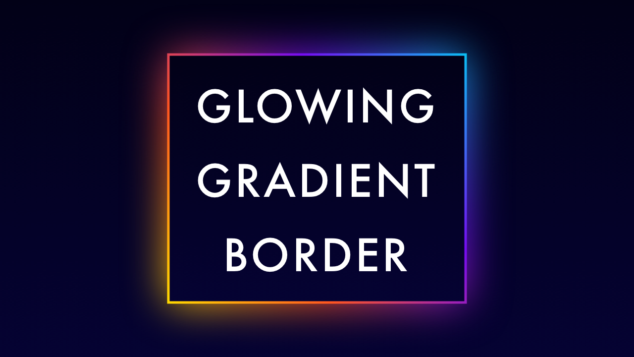
Demo
Video Tutorial
Code
HTML
<!DOCTYPE html>
<html>
  <head>
    <title>Glowing Gradient Border</title>
    <link rel="stylesheet" type="text/css" href="style.css">
  </head>
  <body>
    <div id="container">
      <h1 class="GradientBorder">Glowing Gradient Border</h1>
    </div>
  </body>
</html>
CSS
@import url('https://fonts.googleapis.com/css2?family=Roboto:wght@400&display=swap');
body {
  margin: 0;
  padding: 0;
  font-family: 'Roboto', sans-serif;
  background: url(bg.png);
  background-size: cover;
}
#container {
  width: 100%;
  height: 100vh;
  display: flex;
  align-items: center;
  justify-content: center;
}
.GradientBorder {
  position: relative;
  width: 450px;
  padding: 40px 0;
  font-size: 5em;
  color: #fff;
  text-align: center;
  letter-spacing: 5px;
  background: #020117;
}
.GradientBorder::after {
  content: '';
  position: absolute;
  top: -5px;
  left: -5px;
  right: -5px;
  bottom: -5px;
  background: linear-gradient(45deg, #ffd800, #ff5520, #750cf2, #0cbcf2);
  z-index: -1;
}
.GradientBorder::before {
  content: '';
  position: absolute;
  top: 0;
  left: 0;
  right: 0;
  bottom: 0;
  background: linear-gradient(45deg, #ffd800, #ff5520, #750cf2, #0cbcf2);
  z-index: -2;
  filter: blur(40px);
}