Pure CSS Gradient Text Effects
02/26/2022
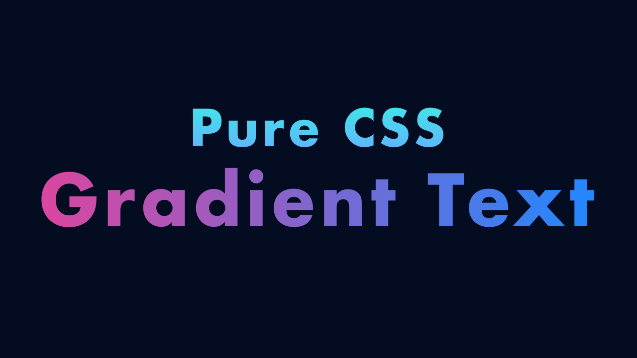
Demo
Video
Code
HTML
<!DOCTYPE html>
<html lang="en">
  <head>
    <meta charset="UTF-8">
    <meta name="viewport" content="width=device-width,initial-scale=1">
    <title>Pure CSS Gradient Text</title>
    <link rel="stylesheet" href="https://use.typekit.net/opg3wle.css">
    <link rel="stylesheet" type="text/css" href="style.css">
  </head>
  <body>
    <div id="container">
      <div class="box">
        <p class="text-gradient-01">Pure CSS</p>
        <h1 class="text-gradient-02">Gradient Text</h1>
      </div>
    </div>
  </body>
</html>
CSS
@charset "utf-8";
* {
  box-sizing: border-box;
  margin: 0;
  padding: 0;
}
html {
  font-size: 16px;
}
body {
  font-weight: 700;
  font-family: futura-pt, sans-serif;
}
#container {
  display: flex;
  justify-content: center;
  align-items: center;
  width: 100%;
  height: 100vh;
  background: #040c21;
}
.box {
  letter-spacing: 2px;
  text-align: center;
}
.text-gradient-01 {
  font-size: 4rem;
  background: linear-gradient(90deg, #64acff, #3bf0e4);
  -webkit-text-fill-color: transparent;
  -webkit-background-clip: text;
}
.text-gradient-02 {
  font-size: 4.75rem;
  background: linear-gradient(45deg, #db469f, #2188ff);
  -webkit-text-fill-color: transparent;
  -webkit-background-clip: text;
}
@media screen and (max-width: 480px) {
  .text-gradient-01 {
  font-size: 2rem;
  }
  .text-gradient-02 {
  font-size: 2.25rem;
  }
}