CSS Change Button Text on Hover
01/23/2021
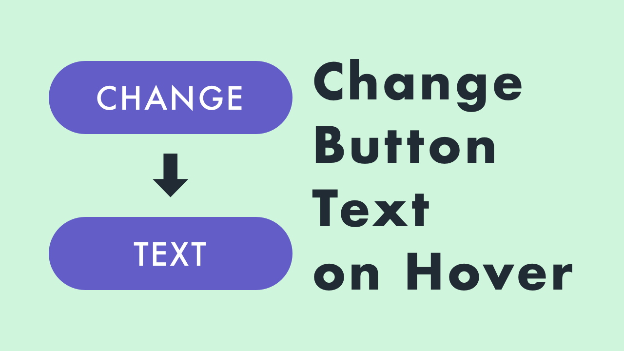
Demo
Code
HTML
<!DOCTYPE html>
<html lang="en">
  <head>
    <meta charset="UTF-8">
    <meta name="viewport" content="width=device-width,initial-scale=1">
    <title>Change Button Text on Hover</title>
    <link rel="stylesheet" type="text/css" href="https://demo.plantpot.works/assets/css/normalize.css">
    <link rel="stylesheet" href="https://use.typekit.net/opg3wle.css">
    <link rel="stylesheet" type="text/css" href="style.css">
  </head>
  <body>
    <div id="container">
      <button class="btn"></button>
      <h1>Change Button Text<br>on Hover</h1>
    </div>
  </body>
</html>
CSS
@charset "utf-8";
* {
  box-sizing: border-box;
  margin: 0;
  padding: 0;
}
html {
  font-size: 16px;
}
body {
  background-color: #cff5dd;
  font-family: futura-pt, sans-serif;
  -webkit-tap-highlight-color: rgba(0,0,0,0);
}
#container {
  display: flex;
  flex-direction: column;
  justify-content: center;
  align-items: center;
  width: 100%;
  height: 100vh;
  padding: 20px;
}
.btn {
  position: relative;
  width: 200px;
  height: 60px;
  overflow: hidden;
  border: none;
  border-radius: 30px;
  background-color: #635dc7;
  color: #fff;
  font-size: 1.5rem;
  letter-spacing: 2px;
  outline: none;
  cursor: pointer;
}
.btn::before {
  display: flex;
  justify-content: center;
  align-items: center;
  position: absolute;
  top: 0;
  left: 0;
  width: 100%;
  height: 100%;
  content: 'CHANGE';
  transition: all .3s;
}
.btn::after {
  display: flex;
  justify-content: center;
  align-items: center;
  position: absolute;
  top: 60px;
  left: 0;
  width: 100%;
  height: 100%;
  content: 'TEXT';
  transition: all .3s;
}
.btn:hover::before {
  top: -60px;
}
.btn:hover::after {
  top: 0;
}
h1 {
  margin: 20px 0 0;
  color: #202b33;
  font-size: 3rem;
  letter-spacing: 1px;
  text-align: center;
}
@media screen and (max-width: 480px) {
  h1 {
    font-size: 2rem;
  }
}