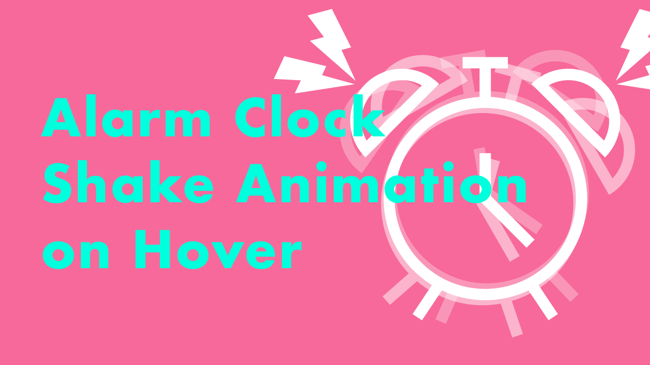
CSS Shake Animation on Hover – Alarm Clock
01/02/2021
Demo
Code
HTML
<!DOCTYPE html>
<html lang="en">
  <head>
    <meta charset="UTF-8">
    <meta name="viewport" content="width=device-width,initial-scale=1">
    <title>CSS Shake Animation on Hover</title>
    <link rel="stylesheet" type="text/css" href="https://demo.plantpot.works/assets/css/normalize.css">
    <link rel="stylesheet" href="https://use.typekit.net/opg3wle.css">
    <link rel="stylesheet" type="text/css" href="style.css">
  </head>
  <body>
    <div id="container">
      <div class="box">
        <img class="alarm-clock" src="alarm_clock.svg" alt="">
        <img class="sound-01" src="sound_01.svg" alt="">
        <img class="sound-02" src="sound_02.svg" alt="">
      </div>
      <h1>CSS Shake Animation<br>on Hover</h1>
    </div>
  </body>
</html>
CSS
@charset "utf-8";
* {
  box-sizing: border-box;
  margin: 0;
  padding: 0;
}
html {
  font-size: 16px;
}
body {
  background-color: #ff5c9a;
  font-family: futura-pt, sans-serif;
  -webkit-tap-highlight-color: rgba(0,0,0,0);
}
#container {
  display: flex;
  flex-direction: column;
  justify-content: center;
  align-items: center;
  width: 100%;
  height: 100vh;
  padding: 20px;
}
.box {
  display: flex;
  justify-content: center;
  align-items: center;
  position: relative;
  width: 240px;
  height: 240px;
}
.box .alarm-clock {
  width: 180px;
}
.box:hover .alarm-clock {
  animation: shake .1s ease-in-out infinite;
}
.box .sound-01 {
  position: absolute;
  top: 5px;
  left: 0;
  width: 40px;
  opacity: 0;
}
.box .sound-02 {
  position: absolute;
  top: 5px;
  right: 0;
  width: 40px;
  opacity: 0;
}
.box:hover .sound-01,
.box:hover .sound-02 {
  opacity: 1;
  animation: sound .1s ease-in-out infinite;
}
@keyframes shake {
  0% {
    transform: rotate(-15deg);
  }
  100% {
    transform: rotate(15deg);
  }
}
@keyframes sound {
  0% {
    transform: rotate(-5deg);
  }
  100% {
    transform: rotate(5deg);
  }
}
h1 {
  margin: 0;
  color: #00ffdc;
  font-size: 3rem;
  letter-spacing: 1px;
  text-align: center;
}
@media screen and (max-width: 480px) {
  #container {
    height: auto;
  }
  .box {
    width: 200px;
    height: 200px;
  }
  .box .alarm-clock {
    width: 140px;
  }
  h1 {
    font-size: 2rem;
  }
}