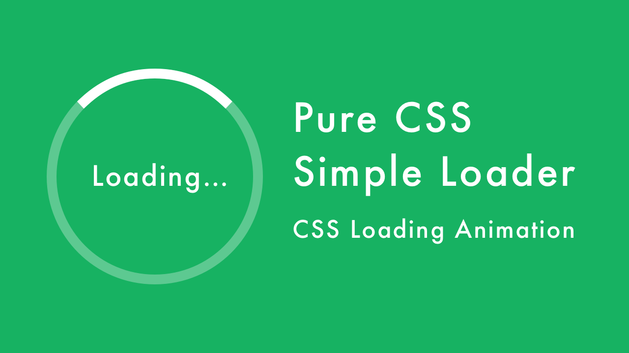
Pure CSS Simple Loader Spinner | CSS Loading Animation
07/12/2020
Demo
Video Tutorial
Code
HTML
<!DOCTYPE html>
<html>
  <head>
    <title></title>
    <link rel="stylesheet" type="text/css" href="style.css">
  </head>
  <body>
    <div id="container">
      <div class="loader">Loading...</div>
    </div>
  </body>
</html>
CSS
@import url('https://fonts.googleapis.com/css2?family=Roboto:wght@400&display=swap');
body {
  margin: 0;
  padding: 0;
  font-family: 'Roboto', sans-serif;
}
#container {
  width: 100%;
  height: 100vh;
  background: #17b262;
  display: flex;
  align-items: center;
  justify-content: center;
}
.loader {
  position: relative;
  width: 120px;
  height: 120px;
  font-size: 24px;
  color: #fff;
  letter-spacing: 2px;
  display: flex;
  align-items: center;
  justify-content: center;
}
.loader::after {
  content: '';
  position: absolute;
  top: -40px;
  left: -40px;
  right: -40px;
  bottom: -40px;
  border-radius: 50%;
  border-top: 12px solid rgba(255, 255, 255, 0.2);
  border-right: 12px solid rgba(255, 255, 255, 0.2);
  border-bottom: 12px solid rgba(255, 255, 255, 0.2);
  border-left: 12px solid #fff;
  transform: translateZ(0);
  animation: load 1.2s infinite linear;
}
@keyframes load {
  0% {
    transform: rotate(0deg);
  }
  100% {
    transform: rotate(360deg);
  }
}