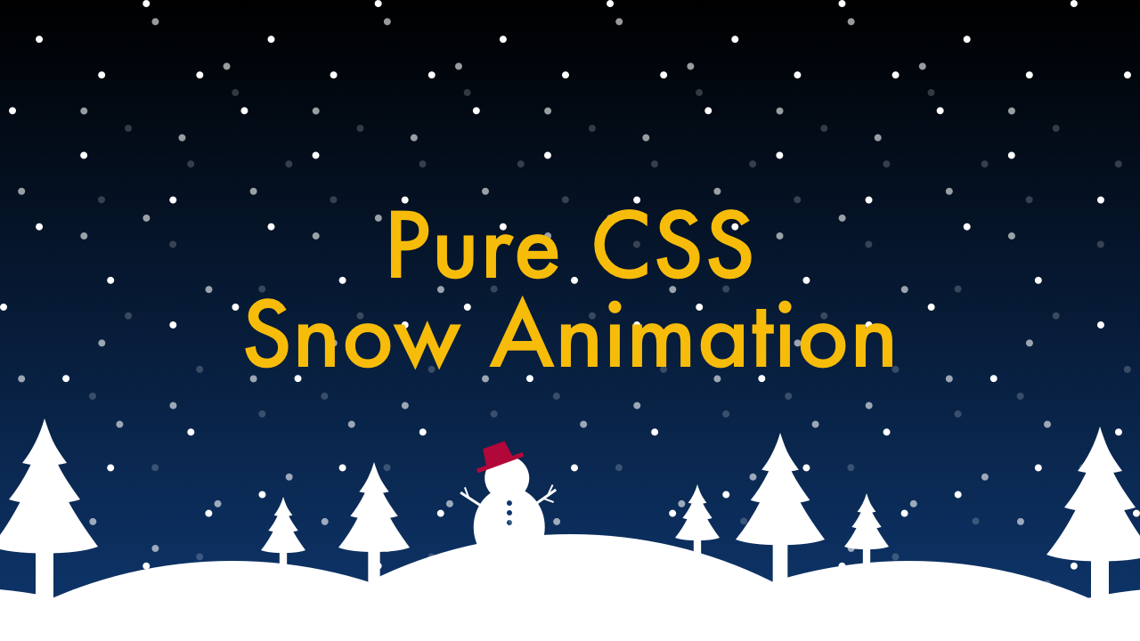
Pure CSS Snow Animation
12/04/2020
Demo
Video Tutorial
Code
HTML
<!DOCTYPE html>
<html>
  <head>
    <meta charset="UTF-8">
    <meta name="viewport" content="width=device-width,initial-scale=1">
    <title>Pure CSS Snow Animation</title>
    <link rel="stylesheet" type="text/css" href="https://demo.plantpot.works/assets/css/normalize.css">
    <link rel="stylesheet" href="https://use.typekit.net/opg3wle.css">
    <link rel="stylesheet" type="text/css" href="style.css">
  </head>
  <body>
    <div id="container">
      <h1>Pure CSS<br>Snow Animation</h1>
      <div class="snow"></div>
    </div>
  </body>
</html>
CSS
@charset "utf-8";
* {
  box-sizing: border-box;
  margin: 0;
  padding: 0;
}
html {
  font-size: 16px;
}
body {
  background: linear-gradient(#000, #0e376f);
  font-family: futura-pt, sans-serif;
  -webkit-tap-highlight-color: rgba(0,0,0,0);
}
#container {
  display: flex;
  justify-content: center;
  align-items: center;
  position: relative;
  width: 100%;
  height: 100vh;
  background-image: url(bg.png);
  background-position: 0 100%;
  background-size: contain;
  background-repeat: no-repeat;
}
h1 {
  color: #f7bc0a;
  font-weight: 500;
  font-size: 4rem;
  letter-spacing: 1px;
  text-align: center;
}
@media screen and (max-width: 480px) {
  h1 {
    font-size: 2rem;
  }
}
.snow {
  position: absolute;
  top: 0;
  left: 0;
  width: 100%;
  height: 100vh;
  background-image: url(snow.png);
  background-repeat: repeat;
  -webkit-animation: snowfall01 20s linear infinite;
  animation: snowfall01 20s linear infinite;
}
.snow::before {
  opacity: .6;
  position: absolute;
  top: 0;
  left: 0;
  width: 100%;
  height: 100vh;
  background-image: url(snow.png);
  background-repeat: repeat;
  content: '';
  -webkit-animation: snowfall02 20s linear infinite;
  animation: snowfall02 20s linear infinite;
}
.snow::after {
  opacity: .4;
  position: absolute;
  top: 0;
  left: 0;
  width: 100%;
  height: 100vh;
  background-image: url(snow.png);
  background-repeat: repeat;
  content: '';
  -webkit-animation: snowfall03 20s linear infinite;
  animation: snowfall03 20s linear infinite;
}
@-webkit-keyframes snowfall01 {
  0% {
    background-position: 0 0;
  }
  100% {
    background-position: 150px 600px;
  }
}
@-webkit-keyframes snowfall02 {
  0% {
    background-position: 0 -200px;
  }
  100% {
    background-position: 0 600px;
  }
}
@-webkit-keyframes snowfall03 {
  0% {
    background-position: 0 200px;
  }
  100% {
    background-position: 300px 600px;
  }
}
@keyframes snowfall01 {
  0% {
    background-position: 0 0;
  }
  100% {
    background-position: 150px 600px;
  }
}
@keyframes snowfall02 {
  0% {
    background-position: 0 -200px;
  }
  100% {
    background-position: 0 600px;
  }
}
@keyframes snowfall03 {
  0% {
    background-position: 0 200px;
  }
  100% {
    background-position: 300px 600px;
  }
}