CSS Pulse Animation Effects
08/29/2021
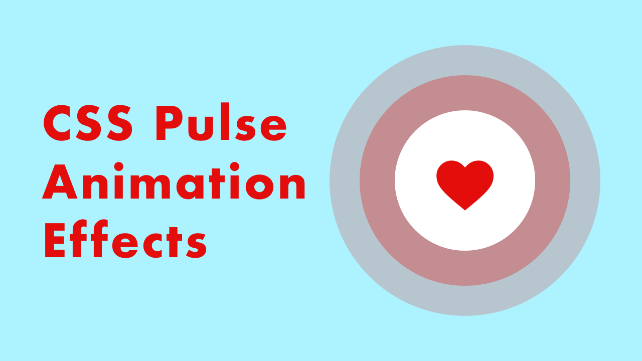
Demo
Code
HTML
<!DOCTYPE html>
<html lang="en">
  <head>
    <meta charset="UTF-8">
    <meta name="viewport" content="width=device-width,initial-scale=1">
    <title>CSS Pulse Animation</title>
    <link rel="stylesheet" type="text/css" href="https://demo.plantpot.works/assets/css/normalize.css">
    <link rel="stylesheet" href="https://use.typekit.net/opg3wle.css">
    <link rel="stylesheet" type="text/css" href="style.css">
  </head>
  <body>
    <div id="container-pulse">
      <div class="box-pulse">
        <div class="pulse">
          <img src="heart.svg" class="heart" alt="">
        </div>
        <h1>CSS Pulse Animation</h1>
      </div>
    </div>
  </body>
</html>
CSS
@charset "utf-8";
* {
  box-sizing: border-box;
  margin: 0;
  padding: 0;
}
html {
  font-size: 16px;
}
body {
  background-color: #adf3ff;
  font-family: futura-pt, sans-serif;
  -webkit-tap-highlight-color: rgba(0,0,0,0);
}
#container-pulse {
  display: flex;
  justify-content: center;
  align-items: center;
  position: relative;
  width: 100%;
  height: 100vh;
}
.box-pulse {
  display: flex;
  flex-direction: column;
  justify-content: center;
  align-items: center;
}
h1 {
  margin-top: 1.25em;
  color: #e30d0b;
  font-size: 1.75rem;
}
.pulse {
  display: flex;
  justify-content: center;
  align-items: center;
  position: relative;
  width: 100px;
  height: 100px;
  border-radius: 50%;
  background-color: #fff;
}
.pulse::before,
.pulse::after {
  opacity: .8;
  position: absolute;
  top: 0;
  right: 0;
  bottom: 0;
  left: 0;
  z-index: -1;
  border-radius: 50%;
  background-color: #e30d0b;
  content: "";
}
.pulse::before {
  animation: pulse-circle 2s ease-out infinite;
}
.pulse::after {
  animation: pulse-circle 2s 1s ease-out infinite;
}
.heart {
  margin-top: 5px;
  animation: pulse-heart 1s ease-in-out infinite;
}
/* pulse animation of heartbeat */
@keyframes pulse-heart {
  0% {
    transform: scale(1);
  }
  50% {
    transform: scale(1.2);
  }
  100% {
    transform: scale(1);
  }
}
/* pulse animation of circle */
@keyframes pulse-circle {
  0% {
    transform: scale(1);
  }
  100% {
    opacity: 0;
    transform: scale(1.8);
  }
}