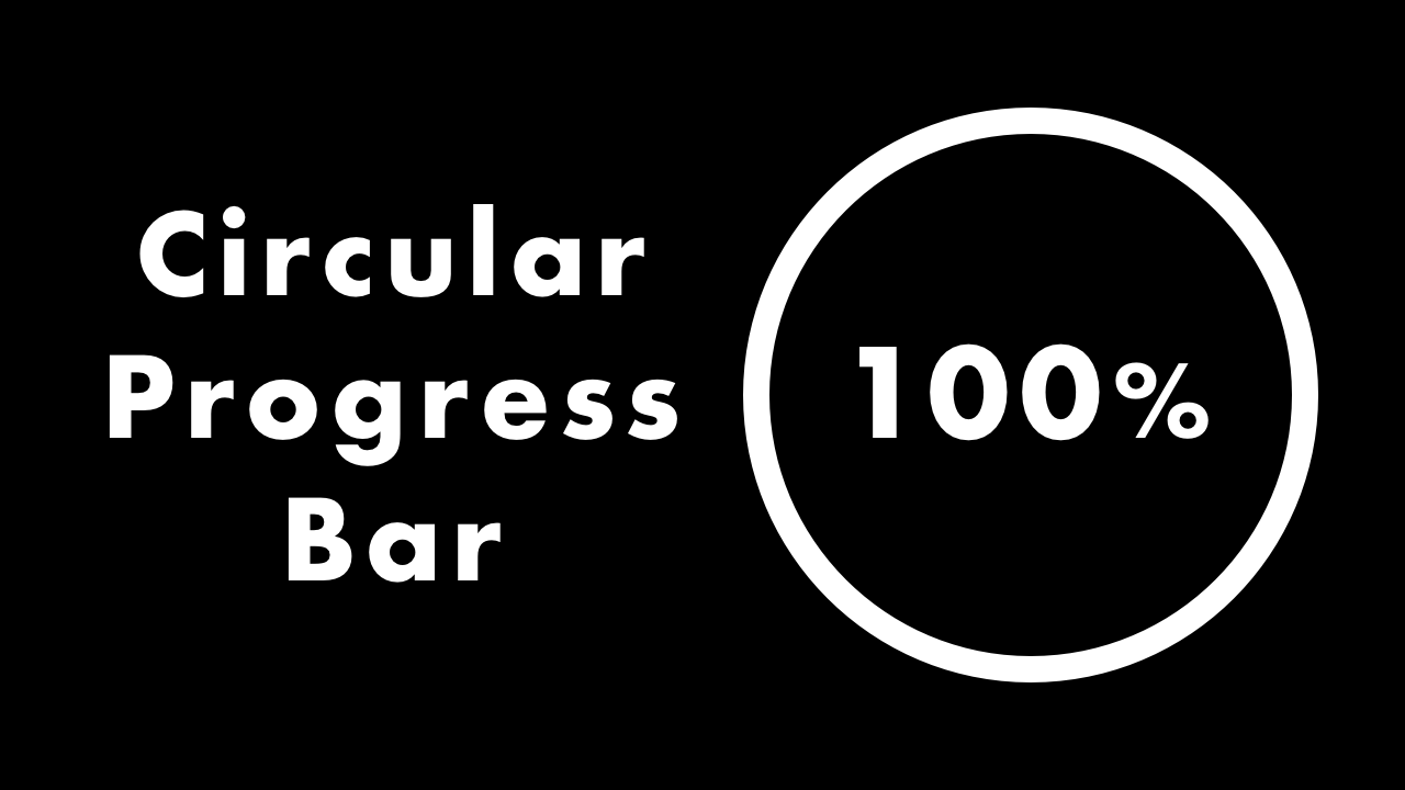
Circular Progress Bar with HTML, CSS & JavaScript
02/22/2021
Demo
Code
HTML
<!DOCTYPE html>
<html lang="en">
  <head>
    <meta charset="UTF-8">
    <meta name="viewport" content="width=device-width,initial-scale=1">
    <title>Circular Progress Bar</title>
    <link rel="stylesheet" type="text/css" href="https://demo.plantpot.works/assets/css/normalize.css">
    <link rel="stylesheet" href="https://use.typekit.net/opg3wle.css">
    <link rel="stylesheet" type="text/css" href="style.css">
  </head>
  <body>
    <div id="container">
      <div class="circular-progress-bar">
        <div class="circle">
          <div class="outer"></div>
          <div class="inner"><span id="progress"></span>%</div>
        </div>
      </div>
      <button id="btn-restart" class="button">Restart</button>
    </div>
  </body>
</html>
CSS
@charset "utf-8";
* {
  box-sizing: border-box;
  margin: 0;
  padding: 0;
}
html {
  font-size: 16px;
}
body {
  background-color: #000;
  font-family: futura-pt, sans-serif;
  -webkit-tap-highlight-color: rgba(0,0,0,0);
}
#container {
  display: flex;
  flex-direction: column;
  align-items: center;
  justify-content: center;
  width: 100%;
  height: 100vh;
}
.circle {
  position: relative;
  z-index: 0;
  width: 160px;
  height: 160px;
  border-radius: 50%;
  background-color: #999;
}
.circle::before {
  position: absolute;
  top: 0;
  left: 0;
  width: 100%;
  height: 100%;
  z-index: 1;
  transform: rotate(0);
  border-radius: 50%;
  background-image: linear-gradient(to right, #fff 50%, transparent 0);
  content: '';
  animation: rotation 8s linear forwards;
}
@keyframes rotation {
  0% {
    transform: rotate(0);
  }
  100% {
    transform: rotate(360deg);
  }
}
.circle::after {
  position: absolute;
  top: 0;
  right: 0;
  z-index: 1;
  width: 0;
  height: 0;
  border-radius: 0 100% 100% 0 / 50%;
  background-color: #fff;
  content: '';
  animation: right 4s step-end forwards;
}
@keyframes right {
  0% {
    width: 0;
    height: 0;
  }
  100% {
    width: 50%;
    height: 100%;
  }
}
.inner {
  display: flex;
  justify-content: center;
  align-items: center;
  position: absolute;
  top: 10px;
  left: 10px;
  z-index: 100;
  width: 140px;
  height: 140px;
  border-radius: 50%;
  background-color: #000;
  color: #fff;
  font-size: 1.25rem;
  text-align: right;
}
#progress {
  width: 50px;
  font-size: 1.75rem;
  text-align: center;
}
.outer {
  position: absolute;
  top: 0;
  left: 0;
  z-index: 10;
  width: 160px;
  height: 160px;
  border-radius: 50%;
  background-image: linear-gradient(to right, #999 50%, transparent 0);
  animation: outer 4s step-end forwards;
}
@keyframes outer {
  0% {
    width: 160px;
    height: 160px;
  }
  100% {
    width: 0;
    height: 0;
  }
}
.button {
  margin-top: 20px;
  padding: 5px 10px;
  border: none;
  background-color: #fff;
  color: #000;
  font-size: 1.25rem;
  outline: none;
  cursor: pointer;
}
JavaScript
var progress = document.getElementById("progress");
var btn = document.getElementById("btn-restart");
var i = 0;

function start() {
  if(i <= 100) {
    progress.innerHTML = i;
    i++;
  }
}

window.addEventListener('load', () => {
  setInterval(start, 80);
});

btn.addEventListener('click', () => {
  location.reload();
});