Light / Dark Mode Toggle with HTML, CSS & JavaScript
06/22/2020
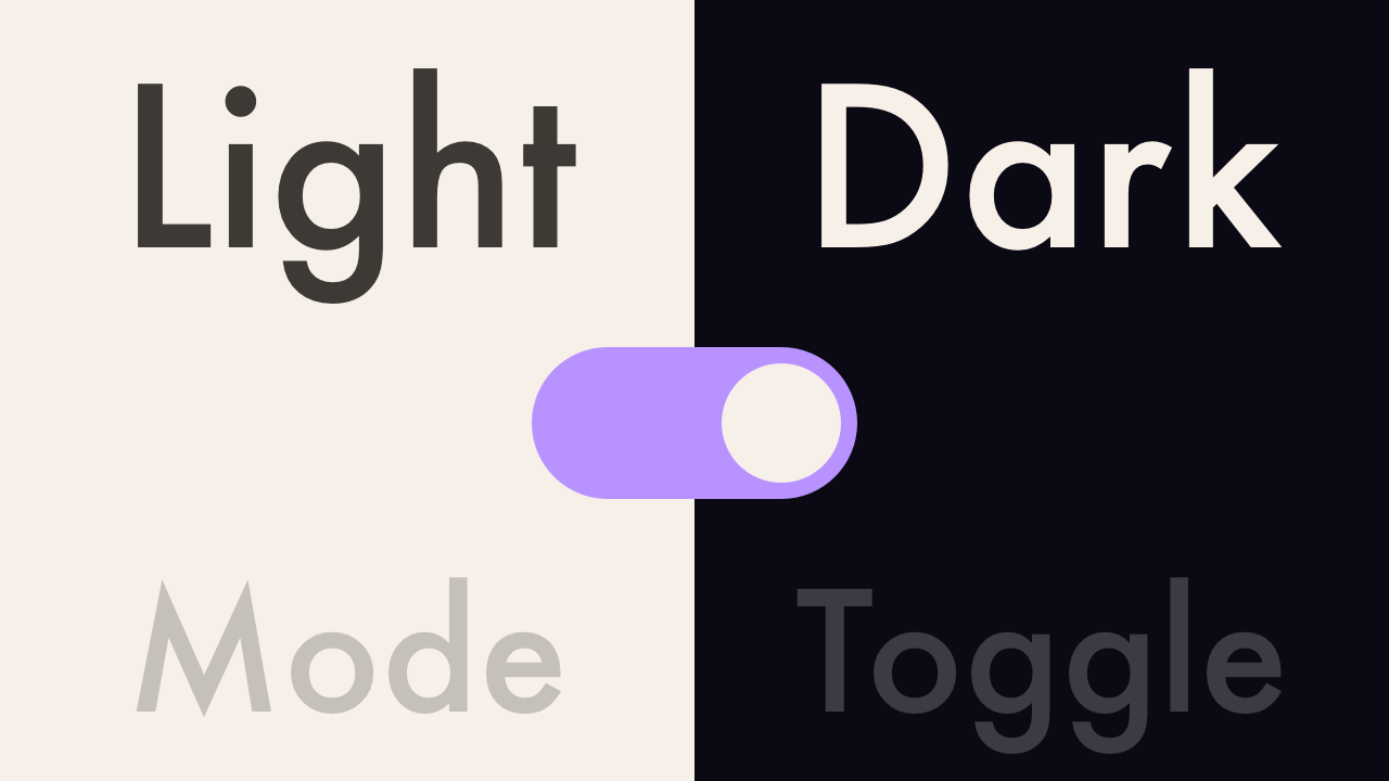
Demo
Video Tutorial
Code
HTML
<!DOCTYPE html>
<html>
  <head>
    <title>Light / Dark Mode Toggle</title>
    <link rel="stylesheet" type="text/css" href="style.css">
  </head>
  <body>
    <div id="container">
      <h1>Light / Dark Mode Toggle</h1>
      <label class="switch">
        <input type="checkbox" onclick="changeMode()">
        <span class="slider"></span>
      </label>
    </div>
    <script>
      function changeMode() {
         var element = document.body;
         element.classList.toggle("dark-mode");
      }
    </script>
  </body>
</html>
CSS
@import url('https://fonts.googleapis.com/css2?family=Roboto:wght@400&display=swap');
body {
  margin: 0;
  padding: 0;
  font-family: 'Roboto', sans-serif;
  background: #f7f0e9;
  transition: .6s;
}
h1 {
  font-size: 5em;
  color: #3d3935;
}
#container {
  width: 100%;
  height: 100vh;
  display: flex;
  flex-direction: column;
  justify-content: center;
  align-items: center;
}
.switch {
  position: relative;
  display: inline-block;
  width: 60px;
  height: 34px;
}
.switch input {
  display: none;
}
.slider {
  position: absolute;
  cursor: pointer;
  top: 0;
  left: 0;
  right: 0;
  bottom: 0;
  background: #ccc;
  border-radius: 34px;
  transition: .4s;
}
.slider:before {
  content: "";
  position: absolute;
  height: 26px;
  width: 26px;
  left: 4px;
  bottom: 4px;
  background: #fff;
  border-radius: 50%;
  transition: .4s;
}
input:checked + .slider {
  background: #b892ff;
}
input:checked + .slider:before {
  transform: translateX(26px);
}
.dark-mode {
  background: #0b0a14;
}
.dark-mode h1 {
  color: #f7f0e9;
}