Button Ripple Effects on Click with HTML, CSS & JavaScript
12/14/2020
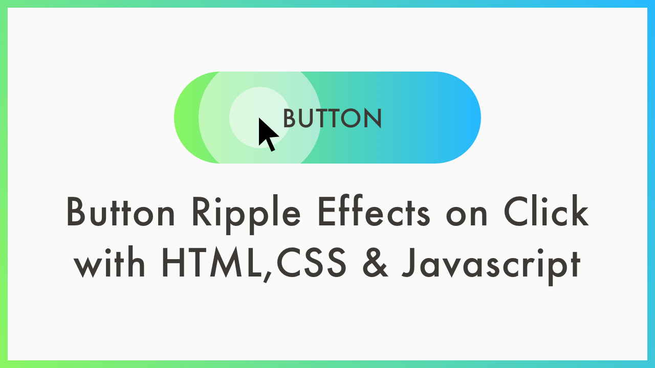
Demo
Video Tutorial
Code
HTML
<!DOCTYPE html>
<html lang="en">
  <head>
    <meta charset="UTF-8">
    <meta name="viewport" content="width=device-width,initial-scale=1">
    <title>Button Ripple Effects on Click</title>
    <link rel="stylesheet" type="text/css" href="https://demo.plantpot.works/assets/css/normalize.css">
    <link rel="stylesheet" href="https://use.typekit.net/opg3wle.css">
    <link rel="stylesheet" type="text/css" href="style.css">
  </head>
  <body>
    <div id="container">
      <button id="button" class="button">BUTTON</button>
      <h1>Button Ripple Effects on Click</h1>
    </div>
  </body>
</html>
CSS
@charset "utf-8";
* {
  box-sizing: border-box;
  margin: 0;
  padding: 0;
}
html {
  font-size: 16px;
}
body {
  font-family: futura-pt, sans-serif;
  -webkit-tap-highlight-color: rgba(0,0,0,0);
}
#container {
  display: flex;
  flex-direction: column;
  justify-content: center;
  align-items: center;
  width: 100%;
  height: 100vh;
}
h1 {
  margin: 20px 0 0;
  color: #3d3935;
  font-weight: 500;
  font-size: 2rem;
  letter-spacing: 1px;
  text-align: center;
}
.button {
  position: relative;
  width: 230px;
  height: 70px;
  overflow: hidden;
  border: none;
  border-radius: 35px;
  background-image: linear-gradient(90deg, #89f661, #26b9ff);
  color: #3d3935;
  font-weight: 500;
  font-size: 1.375rem;
  letter-spacing: 1.5px;
  outline: none;
  cursor: pointer;
}
.button:hover {
  box-shadow: 0px 0px 20px -5px rgba(0, 0, 0, .2);
}
.button::before {
  opacity: 0;
  position: absolute;
  top: calc(100% * var(--ripple-y));
  left: calc(100% * var(--ripple-x));
  transform: translate(-50%, -50%) scale(1);
  padding: 50%;
  border-radius: 50%;
  background-color: #fff;
  content: '';
  transition: transform 1s, opacity 1s;
}
.button:active::before {
  opacity: 1;
  transform: translate(-50%, -50%) scale(0);
  transition: 0s;
}
.button::after {
  opacity: 0;
  position: absolute;
  top: calc(100% * var(--ripple-y));
  left: calc(100% * var(--ripple-x));
  transform: translate(-50%, -50%) scale(1);
  padding: 50%;
  border-radius: 50%;
  background-color: #fff;
  content: '';
  transition: transform 2s, opacity 2s;
}
.button:active::after {
  opacity: 1;
  transform: translate(-50%, -50%) scale(0);
  transition: 0s;
}
@media screen and (max-width: 480px) {
  h1 {
    font-size: 1.75rem;
  }
}
JavaScript
var root = document.documentElement;
document.getElementById("button").onclick = function(ev) {
  var el = ev.target;
  var x = (ev.clientX - el.offsetLeft) / el.offsetWidth;
  var y = (ev.clientY - el.offsetTop) / el.offsetHeight;
    root.style.setProperty('--ripple-x', x);
    root.style.setProperty('--ripple-y', y);
}