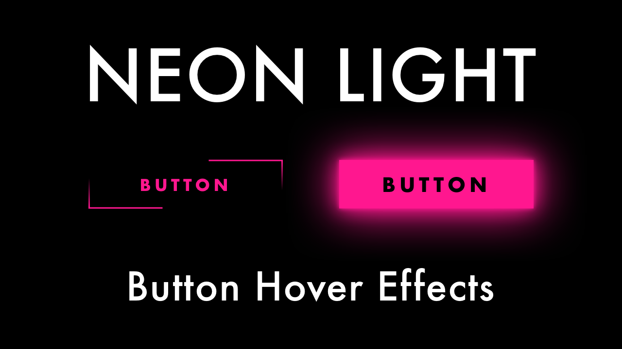
Neon Light Button Animation Effects on Hover with HTML & CSS
07/02/2020
Demo
Video Tutorial
Code
HTML
<!DOCTYPE html>
<html>
  <head>
    <title>Neon Light Button</title>
    <link rel="stylesheet" type="text/css" href="style.css">
  </head>
  <body>
    <div id="container">
      <button>
        <span></span>
        <span></span>
        <span></span>
        <span></span>
        SUBSCRIBE
      </button>
    </div>
  </body>
</html>
CSS
@import url('https://fonts.googleapis.com/css2?family=Roboto:wght@400&display=swap');
body {
  margin: 0;
  padding: 0;
  font-family: 'Roboto', sans-serif;
  background: #000;
}
#container {
  width: 100%;
  height: 100vh;
  display: flex;
  align-items: center;
  justify-content: center;
}
button {
  position: relative;
  cursor: pointer;
  border: none;
  outline: none;
  background: none;
  color: #ff178f;
  font-size: 24px;
  letter-spacing: 4px;
  padding: 15px 50px;
  overflow: hidden;
}
button span {
  position: absolute;
}
button span:nth-child(1) {
  bottom: 0;
  left: -100%;
  width: 100%;
  height: 1px;
  background: linear-gradient(90deg, transparent, #ff178f);
}
button span:nth-child(2) {
  bottom: -100%;
  right: 0;
  width: 1px;
  height: 100%;
  background: linear-gradient(0deg, transparent, #ff178f);
}
button span:nth-child(3) {
  top: 0;
  right: -100%;
  width: 100%;
  height: 1px;
  background: linear-gradient(-90deg, transparent, #ff178f);
}
button span:nth-child(4) {
  top: -100%;
  left: 0;
  width: 1px;
  height: 100%;
  background: linear-gradient(180deg, transparent, #ff178f);
}
button:hover {
  color: #000;
  box-shadow: 0 0 10px #ff178f,
              0 0 40px #ff178f,
              0 0 80px #ff178f;
  background: #ff178f;
  transition-delay: 1s;
}
button:hover span:nth-child(1) {
    animation: leftLine .5s linear 0s;
}
button:hover span:nth-child(2) {
    animation: bottomLine .5s linear .25s;
}
button:hover span:nth-child(3) {
    animation: rightLine .5s linear 0s;
}
button:hover span:nth-child(4) {
    animation: topLine .5s linear .25s;
}
@keyframes topLine {
    0% {
      top: -100%;
    }
    100% {
      top: 100%;
    }
}
@keyframes bottomLine {
    0% {
      bottom: -100%;
    }
    100% {
      bottom: 100%;
    }
}
@keyframes rightLine {
    0% {
      right: -100%;
    }
    100% {
      right: 100%;
    }
}
@keyframes leftLine {
    0% {
      left: -100%;
    }
    100% {
      left: 100%;
    }
}