CSS Flexbox Cards | Creating a Modern CSS Card Design Layout
12/10/2020
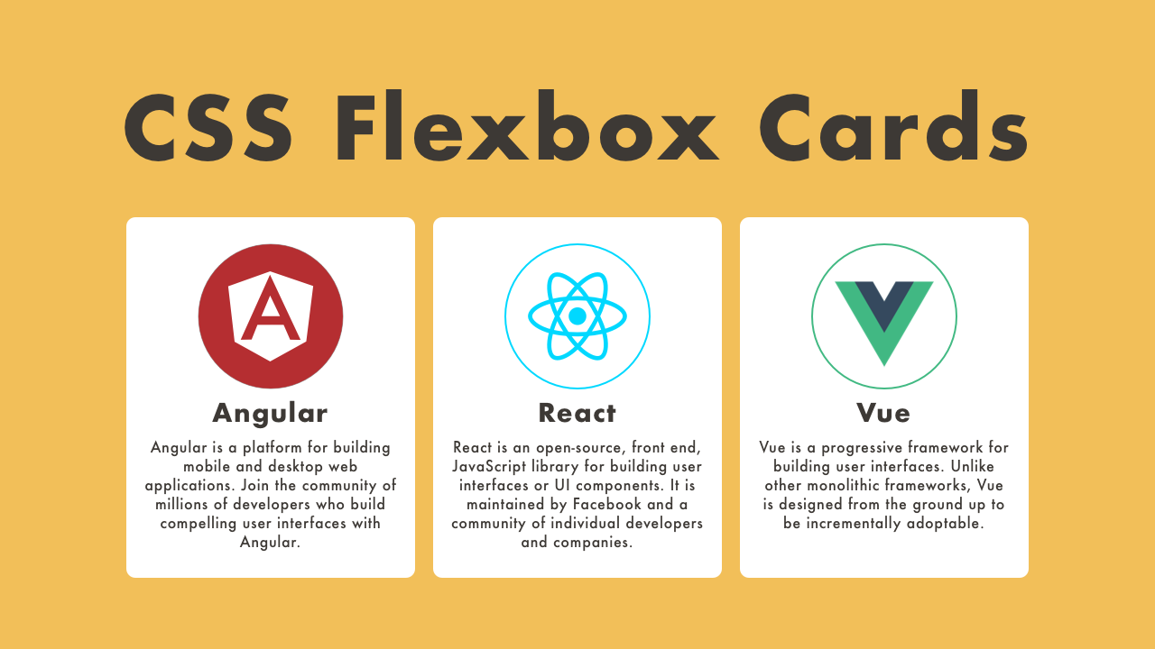
Demo
Code
HTML
<!DOCTYPE html>
<html lang="en">
  <head>
    <meta charset="UTF-8">
    <meta name="viewport" content="width=device-width,initial-scale=1">
    <title>CSS Flexbox Cards</title>
    <link rel="stylesheet" type="text/css" href="https://demo.plantpot.works/assets/css/normalize.css">
    <link rel="stylesheet" href="https://use.typekit.net/opg3wle.css">
    <link rel="stylesheet" type="text/css" href="style.css">
  </head>
  <body>
    <div id="container">
      <div class="box">
        <h1>CSS Flexbox Cards</h1>
        <div class="cards">
          <article class="card">
            <a href="#">
              <figure class="card-thumb">
                <img src="angular.png" alt="angular">
              </figure>
              <div class="card-content">
                <h2 class="card-title">Angular</h2>
                <p class="card-excerpt">Angular is a platform for building mobile and desktop web applications. Join the community of millions of developers who build compelling user interfaces with Angular.</p>
              </div>
            </a>
          </article>
          <article class="card">
            <a href="#">
              <figure class="card-thumb">
                <img src="react.png" alt="react">
              </figure>
              <div class="card-content">
                <h2 class="card-title">React</h2>
                <p class="card-excerpt">React is an open-source, front end, JavaScript library for building user interfaces or UI components. It is maintained by Facebook and a community of individual developers and companies.</p>
              </div>
            </a>
          </article>
          <article class="card">
            <a href="#">
              <figure class="card-thumb">
                <img src="vue.png" alt="vue">
              </figure>
              <div class="card-content">
                <h2 class="card-title">Vue</h2>
                <p class="card-excerpt">Vue is a progressive framework for building user interfaces. Unlike other monolithic frameworks, Vue is designed from the ground up to be incrementally adoptable.</p>
              </div>
            </a>
          </article>
        </div>
      </div>
    </div>
  </body>
</html>
CSS
@charset "utf-8";
* {
  box-sizing: border-box;
  margin: 0;
  padding: 0;
}
html {
  font-size: 16px;
}
body {
  background-color: #f2bf59;
  color: #3d3935;
  font-family: futura-pt, sans-serif;
  -webkit-tap-highlight-color: rgba(0,0,0,0);
}
#container {
  display: flex;
  justify-content: center;
  align-items: center;
  width: 100%;
  height: 100vh;
}
.box {
  width: 100%;
  max-width: 600px;
  padding: 15px;
}
.box h1 {
  margin: 10px 0;
  color: inherit;
  font-size: 2.5rem;
  letter-spacing: 2px;
  text-align: center;
}
.cards {
  display: flex;
  flex-wrap: wrap;
  justify-content: space-between;
  width: 100%;
}
.card {
  width: 32%;
  padding: 15px 10px;
  background-color: #fff;
  border-radius: 3px;
  transition: transform .3s;
}
.card a {
  color: inherit;
  text-decoration: none;
}
.card-thumb {
  width: 100%;
  text-align: center;
}
.card-thumb img {
  width: 80px;
}
.card-title {
  margin: 5px 0;
  font-size: 1.25rem;
  letter-spacing: 1px;
  text-align: center;
}
.card-excerpt {
  font-size: .75rem;
  letter-spacing: 1px;
  text-align: center;
}
.card:hover {
  box-shadow: 0px 0px 20px -5px rgba(0, 0, 0, .2);
	transform: translateY(-4px);
}
@media screen and (max-width: 540px) {
  #container {
    height: auto;
  }
  .box {
    padding: 20px;
  }
  .card {
    width: 49%;
  }
}
@media screen and (max-width: 480px) {
  .box h1 {
    font-size: 1.5rem
  }
  .cards {
    justify-content: center;
  }
  .card {
    margin-bottom: 20px;
    width: 80%;
  }
}