CSS 3D Rotation Animation Effects
12/10/2020
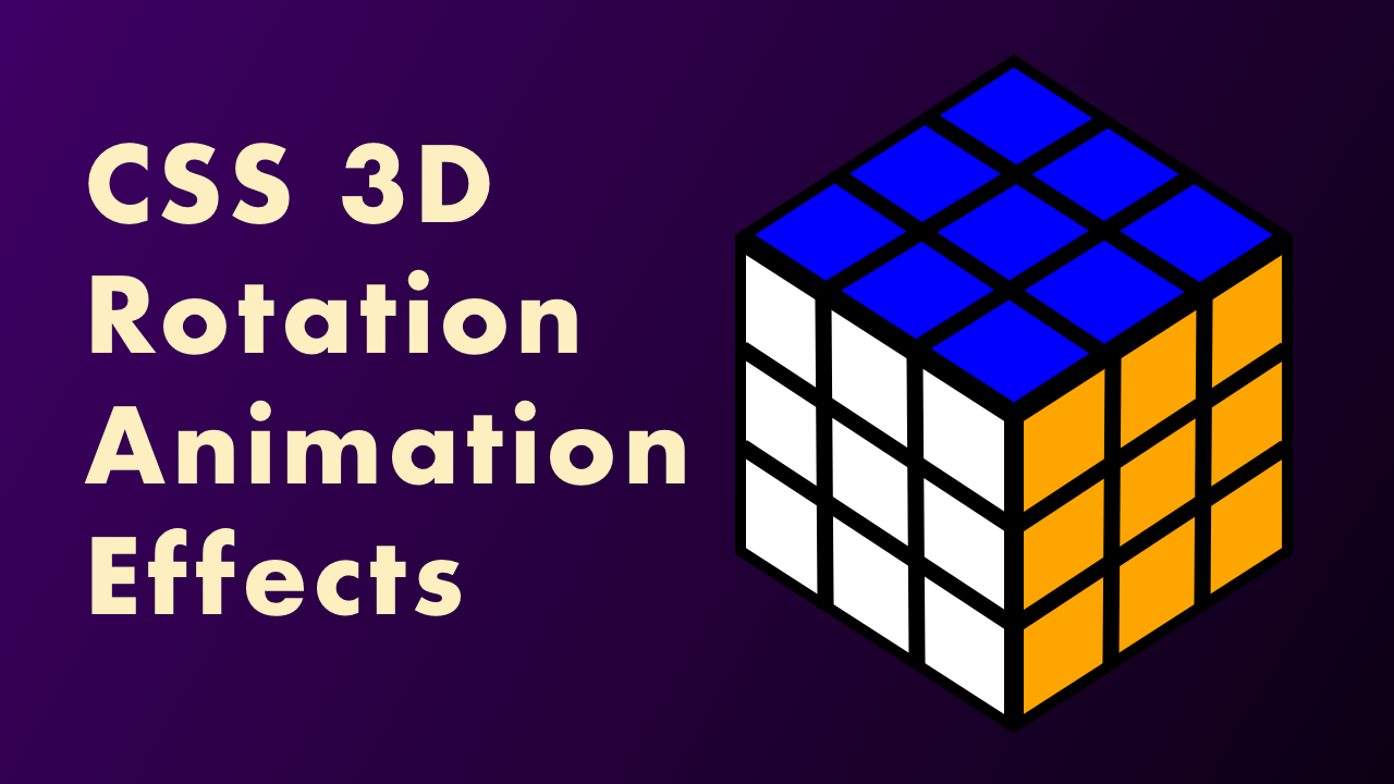
Demo
Video Tutorial
Code
HTML
<!DOCTYPE html>
<html>
  <head>
    <meta charset="UTF-8">
    <meta name="viewport" content="width=device-width,initial-scale=1">
    <title>CSS 3D Rotation Animation Effects</title>
    <link rel="stylesheet" type="text/css" href="https://demo.plantpot.works/assets/css/normalize.css">
    <link rel="stylesheet" href="https://use.typekit.net/opg3wle.css">
    <link rel="stylesheet" type="text/css" href="style.css">
  </head>
  <body>
    <div id="container">
      <div class="cube">
        <div class="face top"></div>
        <div class="face bottom"></div>
        <div class="face front"></div>
        <div class="face back"></div>
        <div class="face left"></div>
        <div class="face right"></div>
      </div>
    </div>
  </body>
</html>
CSS
@charset "utf-8";
* {
  box-sizing: border-box;
  margin: 0;
  padding: 0;
}
html {
  font-size: 16px;
}
body {
  font-family: futura-pt, sans-serif;
  -webkit-tap-highlight-color: rgba(0,0,0,0);
}
#container {
  display: flex;
  justify-content: center;
  align-items: center;
  width: 100%;
  height: 100vh;
  overflow: hidden;
  background: linear-gradient(-45deg, #0d0015, #3e0065);
}
.cube {
  position: relative;
  transform-style: preserve-3d;
  width: 210px;
  height: 210px;
  animation: rotation 10s linear infinite;
}
.face {
  position: absolute;
  width: 100%;
  height: 100%;
  border: 1px solid #000;
  background-image: repeating-linear-gradient(0, #000 0, #000 5px, transparent 5px, transparent 65px, #000 65px, #000 70px),
                    repeating-linear-gradient(90deg, #000 0, #000 5px, transparent 5px, transparent 65px, #000 65px, #000 70px);
}
.top {
  transform: translateY(105px) rotateX(-90deg);
  background-color: #0f0;
}
.bottom {
  transform: translateY(-105px) rotateX(90deg);
  background-color: #00f;
}
.front {
  transform: translateZ(105px);
  background-color: #fff;
}
.back {
  transform: translateZ(-105px) rotateX(180deg);
  background-color: #ff0;
}
.left {
  transform: translateX(-105px) rotateY(-90deg);
  background-color: #f00;
}
.right {
  transform: translateX(105px) rotateY(90deg);
  background-color: #ffa500;
}
@keyframes rotation {
  0%{
    transform: rotateX(0deg) rotateY(0deg);
  }
  100%{
    transform: rotateX(360deg) rotateY(360deg);
  }
}