Pure CSS Modal Box
12/12/2020
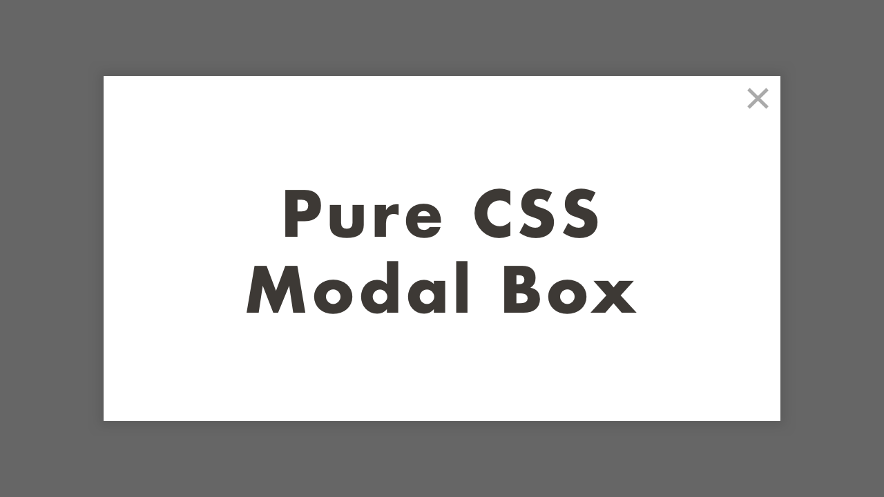
Demo
Code
HTML
<!DOCTYPE html>
<html lang="en">
  <head>
    <meta charset="UTF-8">
    <meta name="viewport" content="width=device-width,initial-scale=1">
    <title>Pure CSS Modal Box</title>
    <link rel="stylesheet" type="text/css" href="https://demo.plantpot.works/assets/css/normalize.css">
    <link rel="stylesheet" href="https://use.typekit.net/opg3wle.css">
    <link rel="stylesheet" type="text/css" href="style.css">
  </head>
  <body>
    <div id="container">
      <a class="modal-open" href="#modal">Open Modal</a>
      <div id="modal" class="modal">
        <a class="modal-overlay" href="#"></a>
        <div class="modal-content">
          <h1>Pure CSS<br>Modal Box</h1>
          <a class="modal-close" href="#">×</a>
        </div>
      </div>
    </div>
  </body>
</html>
CSS
@charset "utf-8";
* {
  box-sizing: border-box;
  margin: 0;
  padding: 0;
}
html {
  font-size: 16px;
}
body {
  font-family: futura-pt, sans-serif;
  -webkit-tap-highlight-color: rgba(0,0,0,0);
}
#container {
  display: flex;
  justify-content: center;
  align-items: center;
  position: relative;
  width: 100%;
  height: 100vh;
}
.modal-open {
  padding: 10px 20px;
  border: 2px solid #3d3935;
  border-radius: 25px;
  background-color: #fff;
  color: #3d3935;
  font-size: 1.25rem;
  text-decoration: none;
}
.modal-open:hover {
  box-shadow: 0px 0px 16px -6px rgba(0, 0, 0, .4);
}
.modal {
  display: flex;
  justify-content: center;
  align-items: center;
  position: absolute;
  top: 0;
  right: 0;
  bottom: 0;
  left: 0;
}
.modal-overlay {
  z-index: 10;
  position: absolute;
  top: 0;
  right: 0;
  bottom: 0;
  left: 0;
  background-color: rgba(0, 0, 0, .6);
}
.modal-content {
  display: flex;
  justify-content: center;
  align-items: center;
  z-index: 999;
  position: relative;
  width: 75%;
  height: 75%;
  box-shadow: 0px 0px 16px -6px rgba(0, 0, 0, .4);
  background-color: #fff;
}
.modal-content h1 {
  margin: 0;
  padding: 0;
  color: #3d3935;
  font-size: 3rem;
  letter-spacing: 1px;
  text-align: center;
}
.modal-content .modal-close {
  position: absolute;
  top: 0;
  right: 5px;
  color: #aaa;
  font-size: 2rem;
  text-decoration: none;
}
.modal-content .modal-close:hover {
  opacity: .8;
}
#modal:not(:target) {
  opacity: 0;
  visibility: hidden;
}
#modal:target {
  opacity: 1;
  visibility: visible;
  transition: opacity .4s, visibility .4s;
}
@media screen and (max-width: 480px) {
  .modal-content h1 {
    font-size: 2rem;
  }
}